
WalletWise Mobile App
Industry: Fintech
My role(s): Product designer
Collaborators: Developers
Overview
WalletWise v2 is a redesign of a Nigerian fintech app built on a clear principle: in financial products, the interface is the primary driver of trust.
Version 1 introduced friction in critical user journeys, resulting in lower transaction completion, increased support requests, and reduced user confidence. The experience lacked clarity, deviated from familiar interaction patterns, and made simple financial actions unnecessarily complex.
WalletWise v2 redefined the experience — simplifying the interface, aligning core flows with user mental models, and removing cognitive overhead across key interactions.
These decisions were grounded in research. Through usability testing and support data analysis, I conducted an affinity mapping exercise to cluster user feedback into key themes, including visual clutter, unclear transaction flow, and cognitive overload. These insights directly informed the redesign.
The impact was immediate and measurable. Within three months, the platform processed over ₦1 billion in transactions, with ₦700 million occurring post-launch. Daily transactions increased by 30%, driven by improved flow completion across the core sending journey. Customer satisfaction improved by 35%, while support ticket volume dropped by 30%, indicating a significant reduction in user friction and stronger transaction confidence. The redesign also drove over 10,000 downloads, with 65% acquired after the v2 release.
THE PROBLEM
V1 worked. The experience didn't.
WalletWise v1 had solid fundamentals: money transfers, bill payments, a referral system. But users were dropping off mid-transfer, and the reasons were structural rather than cosmetic.
The brand purple and other solid colours dominated the home screen, appearing across card backgrounds and high-contrast surfaces simultaneously. With colour doing too much work at once, priority actions became harder to identify at a glance. The transfer flow deviated from the step-by-step pattern users expected from apps like GT bank app, Wise and other fintechs— causing hesitation and errors at the confirmation stage. And on the amount entry screen, users couldn't see their available balance, forcing them to exit the flow mid-transaction just to check.
The initial framing was that the app needed a visual refresh. The real problem was different: every point of friction was eroding the confidence users needed to complete a financial transaction. This reframe shifted the design challenge from visual polish to trust-led product thinking.
RESEARCH & INSIGHTS
What focus groups and dogfooding revealed
Following the v1 launch, we ran two rounds of unmoderated usability testing with 15 users, alongside internal dogfooding across the team. Participants completed key tasks independently, including sending money, checking balances, and navigating the home screen. This allowed us to observe natural behaviour and uncover friction points across critical flows without facilitator influence.
To move beyond isolated observations, I synthesised the findings using an affinity mapping exercise. User feedback, behavioural patterns, and support signals were clustered into recurring themes, ensuring insights were grounded in patterns rather than individual opinions.
Three key themes emerged:
Visual noise and weak hierarchy
Users described the interface as visually overwhelming. The dominant use of colour across multiple elements reduced clarity, making it difficult to distinguish priority actions at a glance.
01
Mismatch with users's mental models for transaction flows
Users expected a familiar, linear flow (recipient → amount → confirmation), shaped by prior experience with modern fintech apps. Deviations from this pattern caused hesitation, confusion, and increased errors at critical stages.
02
Weak transactions feedback and trust signals
The absence of real-time balance visibility during the transfer process created uncertainty. Users frequently exited the flow mid-transaction to verify information, disrupting completion and reducing confidence.
03
These insights led to a clear reframing of the problem: the issue was not visual polish, but a breakdown in trust across key interactions.
From this, we defined a north star metric - transfer completion rate. A successful experience meant users could initiate and complete a transaction without interruption. All subsequent design decisions were aligned to improving completion, reducing friction, and reinforcing user confidence.
PROCESS
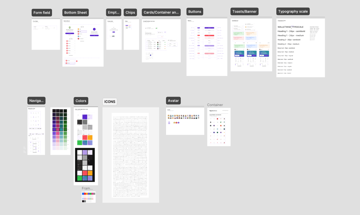
Design System First
Before rebuilding individual screens, the visual foundation was rebuilt. A structured design system was established with a defined type scale - using Inter as the typeface, consistent spacing tokens, and a restrained colour strategy that reserved the brand purple exclusively for primary CTAs and key indicators. This shift from ad-hoc styling to systematic decisions reduced visual clutter across every screen and created a predictable, scannable interface.
Layer 1 - Onboarding Flow
The redesigned onboarding flow was built around a single principle: one screen, one task. Personal details, email verification, PIN creation, avatar selection, and member tag setup are each presented on their own focused screen, stripped of unnecessary elements. Users know exactly what is being asked of them and why.
BVN verification was placed deliberately at the end of the flow, once the user has already invested in the setup process and developed a baseline of trust with the product. This reduces drop-off at what is typically the highest friction point in fintech onboarding.

Layer 2 - Visual System Overhaul
The UI was rebuilt around the principle that in fintech, restraint is a trust signal. The brand colour no longer appears on card backgrounds, section fills, or decorative elements. It is reserved for actions that matter: primary buttons, confirmation states, and key financial indicators. The result is a hierarchy users can read without conscious effort — where to look, what to do, what to ignore.
Icons across the app were replaced with Phosphor Icons — a single, consistent icon pack that brought visual coherence to every surface. The unified stroke weight and familiar aesthetic replaced the oversized decorative icons from v1 with purposeful, legible elements that added clarity rather than visual weight, and signalled the kind of polish that builds quiet confidence in a financial product.

Layer 3 - Transfer Flow Redesign
The sending flow was re-engineered to mirror the mental model users already had from other payment apps: one decision per screen, progressive disclosure, and a logical sequence of who → how much → review → confirm. By aligning the flow with expectations rather than fighting them, the redesign eliminated unnecessary cognitive load at exactly the moment users need to feel confident.
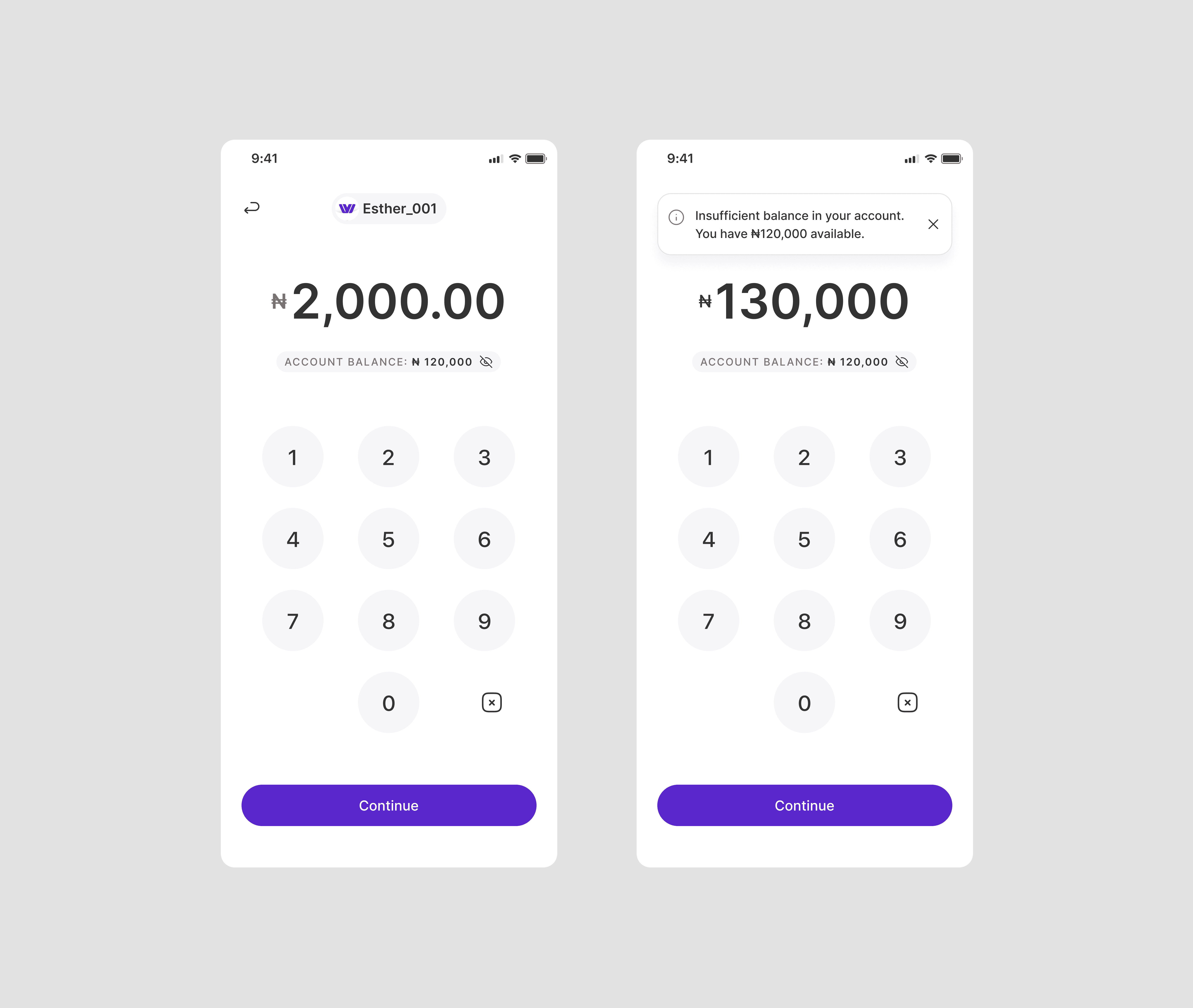
The amount entry screen now surfaces the available balance directly beneath the input field, giving users the one piece of information the decision requires without breaking their flow. Inline error handling for insufficient funds sits at the same step, catching the issue early and redirecting users before they reach confirmation — so the experience feels like guidance rather than failure.
Internal testing backed this up — the majority of participants moved through the redesigned flow without hesitation, with fewer than 5% reporting confusion or uncertainty at any step

Layer 4 - Contextual Balance Display
The amount entry screen now surfaces the user's available balance directly beneath the input field, paired with a visibility toggle for users who prefer privacy. This single addition removes the most common exit trigger in the v1 send flow. The user has everything they need to make a confident decision on one screen: the amount they're sending, the balance they're sending from, and the ability to proceed without second-guessing.
The change is small in terms of screen real estate but significant in terms of user experience. Knowing your balance is not an afterthought in a payment app — it is fundamental to the decision itself.
IMPACT
Measured outcomes
10,000+
App Downloads, 65% post
v2 launch
₦ 1Billion
Transactions processed ₦700M
post launch
35%
Increase in satisfaction
scores
30%
increase in daily transactions
30%
Reduction in support tickets
REFLECTION
What this project reinforced about fintech design
The most important lesson from WalletWise was how much a single colour decision can affect user confidence. Scaling back the brand colour was not a visual preference — it was a product decision that made the app feel more credible and less risky to use. In fintech, where users are handing over real money, the visual system is always communicating something about the product's reliability. Restraint is not timidity; it is a trust strategy.
This project also reinforced how much users rely on mental models from competing apps. Aligning the transfer flow with what users already knew removed friction that had been invisible during the build phase but was costing completions in production. The lesson: test the flow against expectations early, not after high fidelity is committed.
If I were to revisit this, I'd prioritise A/B testing on the screens with the lowest engagement and completion rates. As Jakob Nielsen's usability research established, five users in an unmoderated test can surface roughly 85% of usability issues — and at early stage, that level of rigour is often enough to make sharper decisions before shipping.
NEXT PROJECT
Pesawise Mobile App