
Overview
Pesawise is a Kenyan fintech app focused on cross-border payments, mobile money, and everyday financial management for individuals and SMEs. The redesign was built on a clear principle: for users sending money across borders on low-end Android devices, speed and clarity are trust signals. Anything that slows them down or clutters the decision costs completions.
Version 1 had the right feature set but the wrong experience. Users dropped off during onboarding, abandoned mid-transfer, and struggled to surface common actions like repeat transactions. The interface lacked hierarchy, the send flow fought user expectations, and performance on lower-end devices eroded confidence before trust could be earned.
The v2 redesign simplified the interface, restructured the core transfer flow around familiar mental models, and made the app faster on the devices the audience actually uses. These decisions were grounded in research. Through stakeholder interviews, usage analytics, and a competitive audit of Access Bank, Send by Flutterwave, and Dash, I clustered recurring themes into three clear insight areas that directly shaped the redesign.
The impact was measurable. Within three months of launch, user retention increased by 25% from a 38% baseline, drop-off on the send and onboarding journeys fell by 18%, and support volume around navigation confusion dropped noticeably. A modular design system shortened design-to-dev handoff and has since been reused across subsequent feature releases.
THE PROBLEM
The features worked. The experience didn't.
Pesawise v1 already offered the core fintech stack: cross-border payments, mobile money, bill payments, virtual cards in the roadmap. But users were abandoning at the exact moments where the product needed to earn trust, and the reasons were structural rather than cosmetic.
The home screen buried primary actions inside a dense balance card, with quick actions sitting in low-contrast tiles that competed for attention. The send flow had the send action as a single tap, high-risk for accidental payments on shared or low-end devices. Daily tier limits were never surfaced upfront, so failed transactions happened after users had already committed mentally. And onboarding defaulted to English in a market where a significant portion of users are Swahili-first, adding friction before the first transaction.
The initial framing was that the app needed a visual refresh. The real problem was different: every touchpoint was shaving a small amount of confidence off a user journey that required full confidence to complete. This reframe shifted the brief from UI polish to trust-led product thinking. The v1 screens below show where that friction lived.

Few screens from the Version 1
RESEARCH & INSIGHTS
What the data, the users, and the competitor were saying
Pesawise had strong baseline data on its users: tech-savvy individuals aged 15 to 45, skewed toward entrepreneurs, creatives, and SME owners, many operating on mid-range or older Android devices. We combined this with targeted user interviews, survey responses, and stakeholder sessions to understand where the product was working and where it was losing people.
Alongside the user research, I ran a structured audit of three apps in the same category, Access Bank, Send by Flutterwave, and Dash. The audit wasn't about copying what other apps did, it was about two things: identifying feature gaps users expected Pesawise to close, and understanding the interaction patterns people had already internalised from apps they used daily. Every deviation from those patterns in v1 was a cognitive tax.

Image: competitive audit matrix
The audit revealed feature gaps like beneficiary lists and wallet management, while also mapping the interaction patterns users had already internalised.
A few things stood out. Beneficiary lists and tier-level visibility appeared consistently across every app audited, setting a baseline of user expectation Pesawise was falling short of. Wallet management and nearby contacts were less common, signalling opportunities rather than gaps. The audit gave both the product team a clear feature roadmap and the design work a reference set of interaction patterns to align with.
To move beyond isolated observations, I clustered the findings through an affinity mapping exercise, grouping feedback, analytics signals, stakeholder priorities, and competitor gaps into recurring themes. Three emerged clearly.
Visual overload on the home screen
The balance card carried too many jobs at once, actions, balance, and account state, which flattened hierarchy and made primary tasks harder to scan. Users described the interface as busy and slow to read.
01
Send flow fought user expectations
Users arrived with a mental model shaped by apps they already used, recipient, amount, review, confirm. Pesawise deviated at small but critical steps, and accidental taps on the send button were a real and reported problem. Frequent beneficiaries were also buried, forcing returning users to re-enter details they had used many times before.
02
Missing context at decision moments
Daily tier limits weren't shown on the amount screen, so users only discovered them after a failed transaction. Language selection sat deep in the flow rather than at the first screen, despite a meaningful Swahili-speaking segment.
03
These insights reframed the problem. The redesign wasn't about modernising the UI, it was about reducing friction and restoring confidence at every decision point. From here we defined a north star metric: completion rate across the core send money journey. Every subsequent design decision was evaluated against whether it increased the likelihood of a confident, uninterrupted transaction.
PROCESS
Design System First
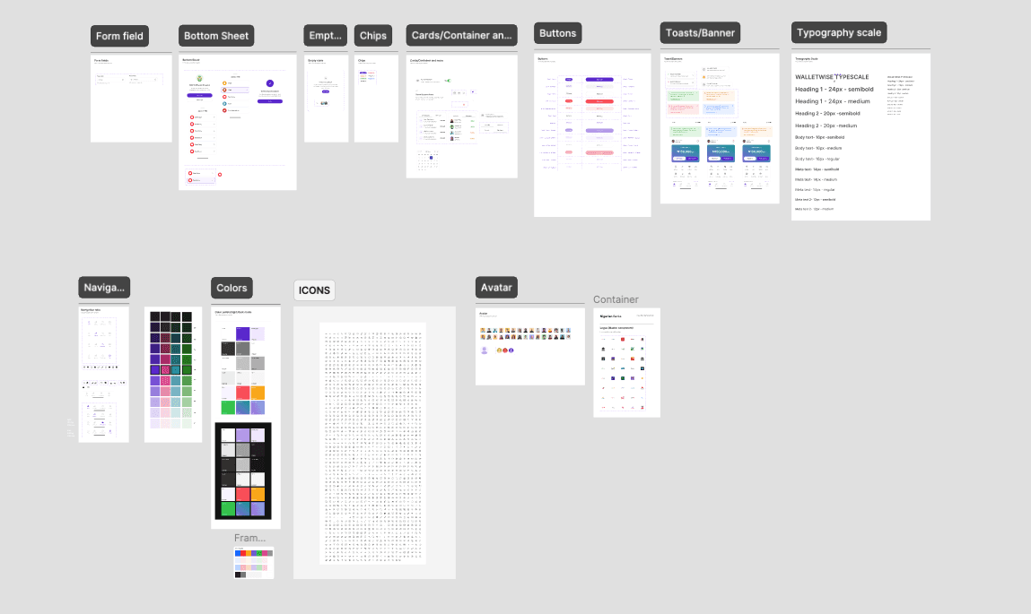
Before touching individual screens, the visual foundation was rebuilt. A modular, token-based design system was established with a defined type scale, consistent spacing, a restrained use of the primary brand colour, and a full set of reusable components. This shift from ad-hoc styling to systematic decisions reduced visual clutter across every screen, created a predictable interface, and made handoff faster for the engineering team. Components built here have since been reused across subsequent feature releases, compounding the return on the investment.
Layer 1 - Onboarding Flow
The redesigned onboarding flow was built around a single principle: one screen, one task. Personal details, email verification, PIN creation, avatar selection, and member tag setup are each presented on their own focused screen, stripped of unnecessary elements. Users know exactly what is being asked of them and why.
BVN verification was placed deliberately at the end of the flow, once the user has already invested in the setup process and developed a baseline of trust with the product. This reduces drop-off at what is typically the highest friction point in fintech onboarding.

Layer 2 - Visual System Overhaul
The home screen was the worst offender in v1, so it received the most focused rework. The balance card was simplified and stripped of embedded actions. Quick actions were repositioned below the card with a lighter shade of the primary colour to lift contrast without adding noise. The brand colour was pulled back from decorative uses and reserved for primary CTAs and key financial indicators, the same restraint-as-trust principle that fintech users respond to.
The result is a hierarchy users can read without effort: where to look, what to do, what to ignore.

Layer 3 - Transfer Flow Redesign
The send flow was re-engineered to mirror the mental model users already had from apps they used daily, one decision per screen, progressive disclosure, and a logical sequence of who, how much, review, confirm.
Frequent beneficiaries now surface directly on the transfer screen, so returning users can skip manual re-entry. The user's daily tier limit is displayed upfront on the amount screen, catching the friction before it turns into a failed transaction. Taps, labels, and screen transitions were tightened throughout, with the whole flow reworked to feel like guidance rather than a form to fill out.

Layer 4 - Swipe to confirm Send
The single-tap send button was replaced with a swipe-to-confirm interaction. In fintech, accidental taps on high-stakes actions erode trust quickly, and a deliberate swipe requires physical intentionality that single taps don't. This is a well-established pattern in financial apps, and it gives users a clear moment of control at the most critical point of the transaction. Combined with the upfront limit display and the cleaner review screen, the send decision feels deliberate rather than casual, which is the correct tone for moving money.

Layer 5 - Performance for Low-End Devices
Because a significant portion of the user base is on older Android hardware, performance was treated as a design input, not an engineering afterthought. Unnecessary animations were removed, transitions simplified, and heavier image assets swapped out or compressed. Every screen was evaluated against how it would render and respond on the devices users actually held, not the devices we designed on.
Prototype
PROCESS
Measured Outcome
The redesign delivered meaningful results within the first three months of launch.
25%
Increase in user retention, up from a 38% baseline pre-launch
18%
Reduction in drop-off across the core send money and onboarding journeys
Higher ratings
App Store and Play Store ratings improved post-launch
Fewer tickets
Support load dropped across navigation, identity verification, and bill payment flows
Fast Delivery
Feature handoff accelerated by the modular design system; v1 component library reused across releases
REFLECTION
What this project reinforced about fintech design
The most important lesson from Pesawise was the difference between designing for competitors and designing for users. Early in the project, competitive benchmarking almost led us to patterns from international fintechs that looked polished but didn't fit the context, low-end devices, bandwidth constraints, and a user base that valued speed and clarity over feature richness. The competitor audit was most useful when we stopped treating it as a list to copy and started treating it as a map of the mental models users had already internalised. Align with the pattern, and friction disappears. Fight it, and you pay for it in completions.
This project also reinforced that a design system is a product decision, not a design deliverable. The component library directly affected how engineering scoped features, how quickly rework cycles closed, and how consistent the final build stayed with the intended design. Treating the system as a product in its own right, with ownership and documentation, was one of the highest-leverage decisions in the project.
Feasibility belongs in discovery, not handoff. Some of the early interaction ideas, particularly around animated transitions and real-time balance updates, had to be scaled back because of device performance. The lesson wasn't just to talk to engineers earlier, it was to treat technical constraints as a design input from the wireframing stage. Bringing engineering in that early changed the quality of the decisions we made together, and it's a practice I've carried into every project since.
If I were to revisit this, I'd run more targeted usability testing on the highest drop-off screens before shipping. Five users in an unmoderated test surfaces most usability issues, and that level of rigour earlier in the process would have sharpened a few decisions I only got right after the first post-launch round of feedback.